

Title
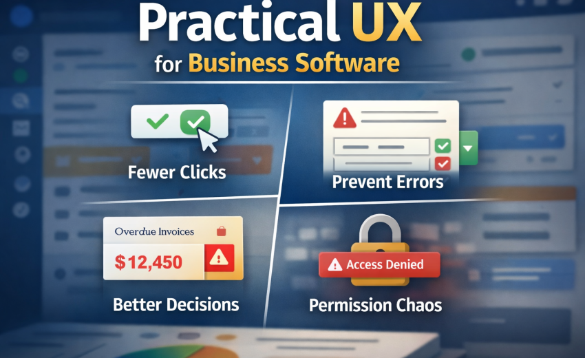
Practical UX for Business Software: Fewer Clicks, Fewer Errors, Better Decisions, Less Permission Chaos
If you build SaaS/ERP/ops tools, your UX job isn’t “make it pretty.” It’s: reduce operator workload without removing control, prevent expensive mistakes, and help users make decisions fast—even when the network is slow and permissions are messy.
This post is a practical playbook you can apply immediately.
1) Reducing clicks without removing control
Most teams reduce clicks by removing steps. That’s how you accidentally remove control and create “silent automation” mistrust. The goal is different:
The real goal
Reduce thinking and navigation, not oversight.
Users don’t hate steps; they hate pointless steps.
Practical patterns that work (and don’t piss people off)
A) Inline actions where decisions happen
If the user is reading a row, card, or detail panel, actions should live there.
- Table row actions: Approve, Void, Duplicate, Refund
- Detail header actions: Edit, Change status, Print, Share
- Side panel quick actions: Add note, Attach file, Assign owner
Rule: Don’t make people open a new page just to do a common action.
B) Progressive disclosure: “simple first, power later”
You keep control by hiding rare options behind “Advanced” or an overflow menu.
- Default: show 3–5 most common fields/actions
- Advanced: show the “tax rounding mode”, “inventory valuation rule”, etc.
Good UI: “More options” is one click away, but not mandatory.
C) Batch operations
If users repeat the same action 20 times, you’ve designed a tax on their time.
- Bulk select rows → Bulk status update
- Bulk assign owner
- Bulk export / bulk tag / bulk mark as paid
- Bulk “apply template” (same payment terms, same warehouse)
Brutal truth: If your ops team uses Excel for this, your UI is failing.
D) Smart defaults that are visible and reversible
Defaults reduce clicks, but only if users can see and change them.
Examples:
- Default warehouse = last used (but show it)
- Default currency = customer currency
- Default tax = product tax class
- Default payment terms from customer
Rule: A default must be (1) obvious, (2) editable, (3) remembered.
E) One-screen flows with “Save as Draft”
The fastest workflow is the one that doesn’t punish interruptions.
- Draft mode + autosave
- “Create invoice” → can be left incomplete
- “Submit” becomes a deliberate final step
This is how you reduce clicks without forcing perfect completion in one sitting.
Quick checklist: click reduction without losing control
- Can the user complete the top 3 tasks without page switching?
- Are rare settings behind Advanced?
- Is there bulk action for repetitive ops?
- Are defaults visible and easy to override?
- Can a task be saved as draft?
2) Designing forms that prevent errors (validation, defaults, autosave)
Forms are where your software either becomes trusted… or becomes a liability.
Error prevention beats error messages
Validation is necessary, but it’s the last line of defense. Better:
A) Constrain inputs so wrong data is hard to enter
- Use dropdowns for known sets (but allow search)
- Use masked input for phone numbers / IDs
- Use date pickers
- Use numeric formatting + min/max
- Use “typeahead” for selecting entities (customers, accounts, products)
Rule: If users can type garbage, they eventually will.
B) Validate at the right time
- Real-time validation for format issues (email, required fields)
- On-blur validation for “soft” constraints
- On-submit validation for cross-field rules
Avoid: screaming red errors while the user is still typing.
C) “Inline correction” beats modal alerts
Bad: “Error occurred” modal.
Good: field-level message + highlight + clear fix.
Example microcopy:
- “Quantity can’t be 0. Minimum is 1.”
- “Discount can’t exceed line total.”
- “This item is out of stock in Warehouse A.”
D) Defaults that reflect workflow reality
Defaults should match what users usually mean.
Examples in business apps:
- Posting date defaults to today
- Warehouse defaults to user’s branch default
- Payment method defaults to last used
- Account defaults based on product/service type
But: always show it and allow override.
E) Autosave that doesn’t create chaos
Autosave is great until it creates “ghost records.”
Practical approach:
- Autosave only after the first meaningful input
- Create record as Draft
- Show “Saved” state + timestamp
- Provide “Discard draft” and “Restore” options
- Prevent duplicate drafts (one draft per entity + user)
Rule: Autosave must be transparent, not mysterious.
F) Confirmations only for irreversible actions
Stop confirming everything. Confirm only when the action is:
- irreversible (delete, void, finalize, submit to authority)
- expensive (mass update 500 records)
- external (send email/SMS, payment capture)
Form reliability checklist
- Can users understand what’s required without trial-and-error?
- Do errors explain exactly how to fix?
- Are there clear drafts and autosave indicators?
- Are irreversible actions gated properly?
- Are defaults aligned with real usage?
3) Empty states, loading states, failure states — the “real UX”
Most apps look okay in demos. Real UX is what happens when:
- there’s no data
- the network is slow
- the API fails
- permissions block things
- the user made a mistake
A) Empty states: teach + route to action
Empty state should do 3 jobs:
- Explain what this screen is for
- Why it’s empty
- The next best action
Good empty state components:
- A one-sentence explanation
- A primary CTA: “Create your first …”
- Optional secondary: “Import”, “Watch demo”, “Learn how”
- If filters are applied: “Clear filters”
Example:
No Invoices yet
Create invoices to track revenue and payments.
[Create invoice] [Import CSV]
B) Loading states: don’t freeze the UI
Two rules:
- Don’t show spinners everywhere.
- Don’t jump layout.
Use:
- Skeletons for tables/cards
- “Optimistic UI” for small operations (tagging, notes)
- Preserve layout height
Brutal truth: If your UI jitters and reflows, users assume it’s broken.
C) Failure states: be specific and recoverable
Your failure messages must answer:
- What happened?
- What can I do now?
- Is my data safe?
Bad: “Something went wrong.”
Good:
“Couldn’t save invoice (network timeout). Your changes are still in draft.”
[Retry] [Copy details] [Save offline]
D) Offline-ish resilience (even if you’re not “offline”)
Business users operate in bad networks. Give them:
- retry buttons
- queued actions (optional)
- draft persistence
- clear status badges: “Saving… / Saved / Failed”
Real UX checklist
- Does every empty state have a clear primary CTA?
- Do filters causing empty lists explain it?
- Do loading states preserve layout and reduce anxiety?
- Are failures specific, safe, and recoverable?
4) Designing dashboards that show decisions, not numbers
Most dashboards are vanity charts. Operators don’t need more numbers; they need what to do next.
What dashboards should actually answer
- What’s urgent?
- What changed since yesterday?
- Where are we losing money/time?
- What needs attention from me (my role)?
A) Use “decision cards” instead of chart soup
A dashboard should be structured around action buckets:
1) Exceptions (things that shouldn’t happen)
- Invoices overdue > 30 days
- Stock below reorder point
- Shipments delayed > 48 hours
- Payments failed
- Approvals pending
Each should have:
- count
- business impact (“$12,450 overdue”)
- one-click drilldown to the filtered list
2) Trends with context (not raw graphs)
If you show a chart, add:
- benchmark (“vs last week”)
- cause hints (“big drop from supplier delays”)
- next step (“review top 5 delayed routes”)
3) Work queue
Most business software is a queue manager.
- “Approvals waiting”
- “Tasks assigned to me”
- “Items needing review”
- “Exceptions I own”
B) Role-based dashboards
A CFO dashboard and an ops manager dashboard should not be the same.
Examples:
- Finance: overdue, cashflow, approvals, margin exceptions
- Ops: delays, capacity, exceptions, pending tasks
- Sales: pipeline health, follow-ups, churn risks
Brutal truth: One-size dashboards are lazy product design.
Dashboard checklist
- Every widget answers “so what?”
- Every widget has a drilldown action
- Exceptions and queues are first-class
- Dashboards change based on role and permissions
5) Permission-based UI: why it’s always buggy
Permission-based UI is buggy because teams treat it like “hide/show menu items.” That’s not permissions. That’s cosmetics.
The truth: permissions are a product surface area multiplier
Every feature becomes:
- view-only
- edit
- approve
- delete
- export
- perform sensitive actions (refund, void, finalize)
…and each of those varies by role, branch, team, ownership, status, and sometimes amount thresholds.
If you don’t model it properly, you get:
- buttons that show but fail on click
- hidden actions users need
- inconsistent behavior across pages
- security holes (UI hides but API allows)
Practical approach that actually works
A) Server is the source of truth
The frontend should not “guess” permissions.
Backend should return a capabilities object per user (and sometimes per record):
can_viewcan_editcan_deletecan_approvecan_exportcan_voidcan_refund
For record-level permissions, return it with each record (or via a policy endpoint).
B) Design “disabled with reason” over “hidden”
Hidden creates confusion: “Where did the button go?”
Disabled with tooltip creates clarity:
- “You need Approver role”
- “Cannot edit after posting”
- “Refunds allowed only within 7 days”
Rule: Hide only when the action is irrelevant. Disable when the action is relevant but not allowed.
C) Permission + state matrix is mandatory
Most bugs happen because permissions depend on state.
Example: Invoice
- Draft → editable
- Posted → not editable, but can void (if role)
- Paid → cannot void, can refund (if role)
You need a matrix like:
- Role × State × Action → Allowed?
If you don’t explicitly define it, you’ll ship contradictions.
D) Keep UI consistent even when denied
Users hate this:
- “Edit” exists in one screen but not in another
- “Export” exists in list but not in report page
Pick rules and apply them everywhere via shared components:
<Can action="invoice.edit">...</Can>useCapabilities()hook or policy service layer
Permission UI checklist
- Backend provides capabilities (global + per record where needed)
- UI disables with clear reasons
- Permissions account for entity state transitions
- Shared permission logic components exist (not copied everywhere)
- API enforcement exists (UI is not security)
Wrap-up: the practical standard you should aim for
If you do these five things well, your product stops feeling like a “feature catalog” and starts feeling like a reliable operations tool:
- Reduce navigation and repetition, not control
- Prevent errors through constraints + good validation timing
- Treat empty/loading/failure as first-class UX
- Design dashboards for action and exceptions
- Build permissions as a real system, not UI tricks

February 12, 2026
AI/ML Product Management: The Practical Playbook (No Hype)

February 12, 2026